 Index › Data Grid
the data surface
Index › Data Grid
the data surface
The table.
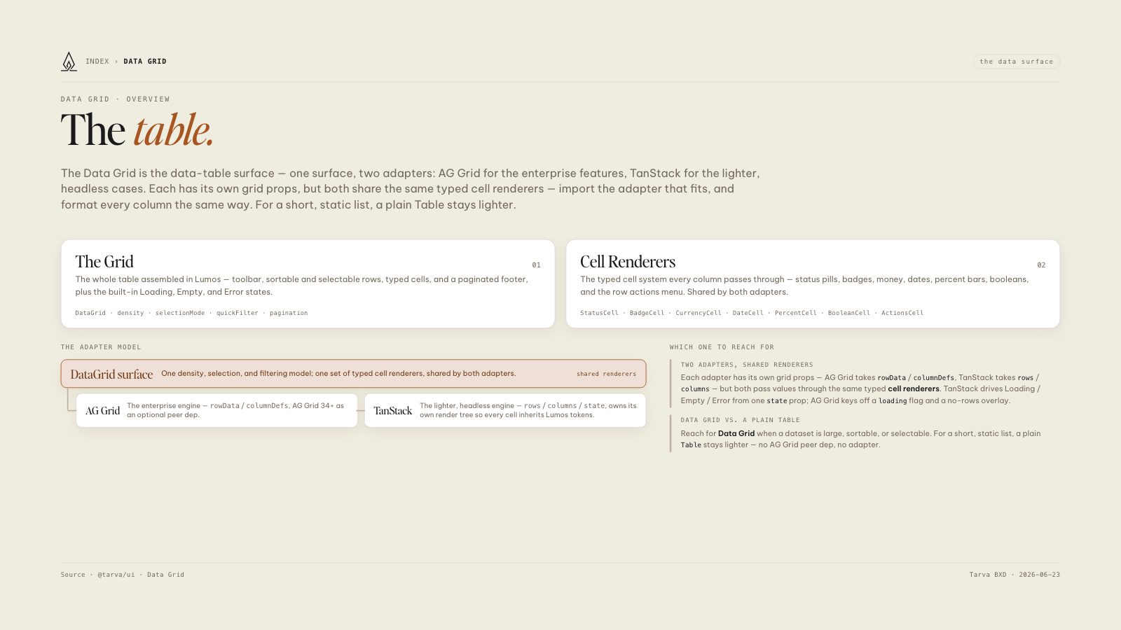
The Data Grid is the data-table surface — one surface, two adapters: AG Grid for the enterprise features, TanStack for the lighter, headless cases. Each has its own grid props, but both share the same typed cell renderers — import the adapter that fits, and format every column the same way. For a short, static list, a plain Table stays lighter.
The Grid
01The whole table assembled in Lumos — toolbar, sortable and selectable rows, typed cells, and a paginated footer, plus the built-in Loading, Empty, and Error states.
Cell Renderers
02The typed cell system every column passes through — status pills, badges, money, dates, percent bars, booleans, and the row actions menu. Shared by both adapters.
rowData / columnDefs, AG Grid 34+ as an optional peer dep.
rows / columns / state, owns its own render tree so every cell inherits Lumos tokens.
Each adapter has its own grid props — AG Grid takes rowData / columnDefs, TanStack takes rows / columns — but both pass values through the same typed cell renderers. TanStack drives Loading / Empty / Error from one state prop; AG Grid keys off a loading flag and a no-rows overlay.
Reach for Data Grid when a dataset is large, sortable, or selectable. For a short, static list, a plain Table stays lighter — no AG Grid peer dep, no adapter.