Tarva BXD · LumosIndex › Foundations › Tokens · Typography · 4/4
1920 × 1080 · Landscape
 Index › Foundations › Tokens › Typography
4 of 4 · Hierarchy
Index › Foundations › Tokens › Typography
4 of 4 · Hierarchy
Tokens · Typography · Hierarchy
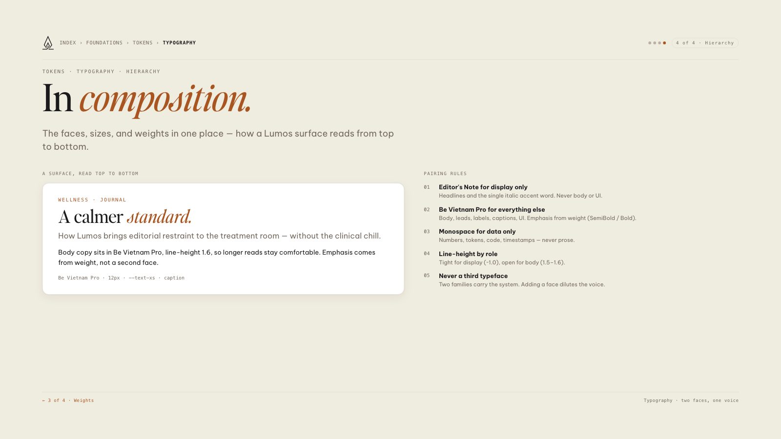
In composition.
The faces, sizes, and weights in one place — how a Lumos surface reads from top to bottom.
A surface, read top to bottom
Wellness · Journal
A calmer standard.
How Lumos brings editorial restraint to the treatment room — without the clinical chill.
Body copy sits in Be Vietnam Pro, line-height 1.6, so longer reads stay comfortable. Emphasis comes from weight, not a second face.
Be Vietnam Pro · 12px · --text-xs · caption
Pairing rules
01
Editor's Note for display only
Headlines and the single italic accent word. Never body or UI.
02
Be Vietnam Pro for everything else
Body, leads, labels, captions, UI. Emphasis from weight (SemiBold / Bold).
03
Monospace for data only
Numbers, tokens, code, timestamps — never prose.
04
Line-height by role
Tight for display (~1.0), open for body (1.5–1.6).
05
Never a third typeface
Two families carry the system. Adding a face dilutes the voice.
8.5 × 11 · Portrait