Tarva BXD · LumosIndex › Components › Actions
1920 × 1080 · Landscape
 Index › Components › Actions
8 components
Index › Components › Actions
8 components
Components · Actions
In action.
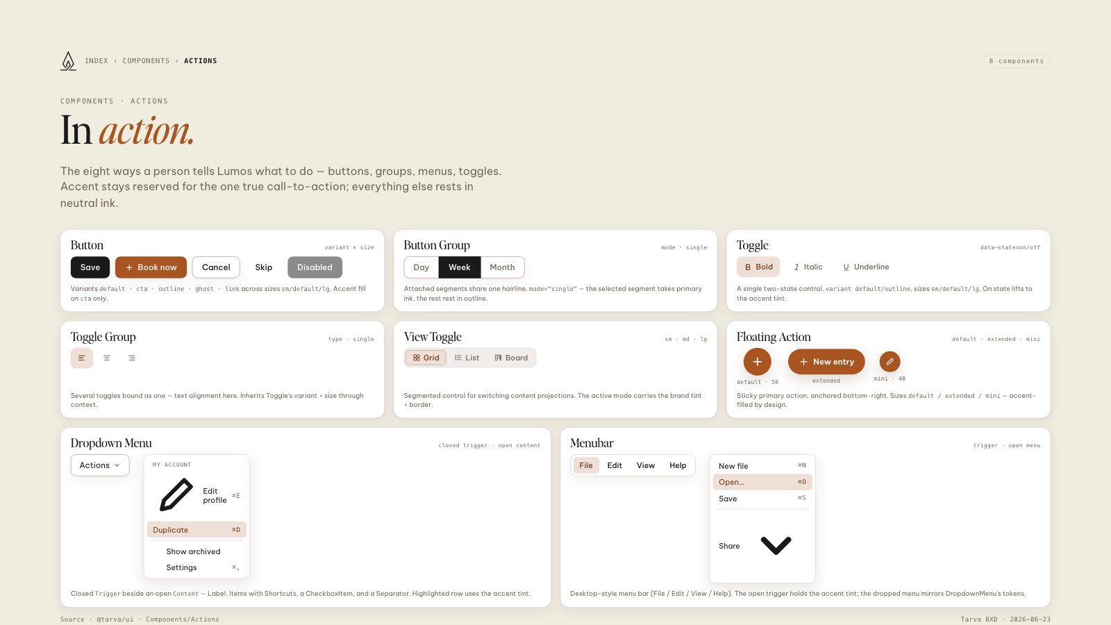
The eight ways a person tells Lumos what to do — buttons, groups, menus, toggles. Accent stays reserved for the one true call-to-action; everything else rests in neutral ink.
Buttonvariant × size
Save
Book now
Cancel
Skip
Disabled
Variants
default · cta · outline · ghost · link across sizes sm/default/lg. Accent fill on cta only.Button Groupmode · single
Day
Week
Month
Attached segments share one hairline.
mode="single" — the selected segment takes primary ink, the rest rest in outline.Toggledata-state=on/off
Bold
Italic
Underline
A single two-state control.
variant default/outline, sizes sm/default/lg. On state lifts to the accent tint.Toggle Grouptype · single
Several toggles bound as one — text alignment here. Inherits Toggle's variant + size through context.
View Togglesm · md · lg
Grid
List
Board
Segmented control for switching content projections. The active mode carries the brand tint + border.
Floating Actiondefault · extended · mini
default · 56
New entryextended
mini · 40
Sticky primary action, anchored bottom-right. Sizes
default / extended / mini — accent-filled by design.Dropdown Menuclosed trigger · open content
Actions
Closed
Trigger beside an open Content — Label, Items with Shortcuts, a CheckboxItem, and a Separator. Highlighted row uses the accent tint.Menubartrigger · open menu
Desktop-style menu bar (File / Edit / View / Help). The open trigger holds the accent tint; the dropped menu mirrors DropdownMenu's tokens.
8.5 × 11 · Portrait