Tarva BXD · LumosIndex › Components › Dialog
1920 × 1080 · Landscape
 Index › Components › Dialog
Flagship · variants + states
Index › Components › Dialog
Flagship · variants + states
Components · Dialog
A focused moment.
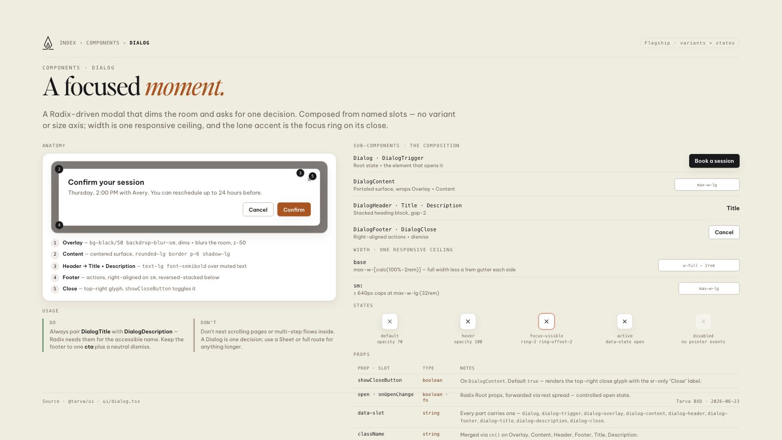
A Radix-driven modal that dims the room and asks for one decision. Composed from named slots — no variant or size axis; width is one responsive ceiling, and the lone accent is the focus ring on its close.
Anatomy
1
2
5
3
Confirm your session
Thursday, 2:00 PM with Avery. You can reschedule up to 24 hours before.
4
Cancel
Confirm
1Overlay — bg-black/50 backdrop-blur-sm, dims + blurs the room, z-50
2Content — centered surface, rounded-lg border p-6 shadow-lg
3Header → Title + Description — text-lg font-semibold over muted text
4Footer — actions, right-aligned on sm, reversed-stacked below
5Close — top-right glyph, showCloseButton toggles it
Usage
Do
Always pair DialogTitle with DialogDescription — Radix needs them for the accessible name. Keep the footer to one cta plus a neutral dismiss.
Don't
Don't nest scrolling pages or multi-step flows inside. A Dialog is one decision; use a Sheet or full route for anything longer.
Sub-components · the composition
Dialog · DialogTrigger
Root state + the element that opens it
Book a session
DialogContent
Portaled surface, wraps Overlay + Content
DialogHeader · Title · Description
Stacked heading block, gap-2
Title
DialogFooter · DialogClose
Right-aligned actions + dismiss
Cancel
Width · one responsive ceiling
base
max-w-[calc(100%-2rem)] — full width less a 1rem gutter each side
sm:
≥ 640px caps at max-w-lg (32rem)
States
default
opacity 70
opacity 70
hover
opacity 100
opacity 100
focus-visible
ring-2 ring-offset-2
ring-2 ring-offset-2
active
data-state open
data-state open
disabled
no pointer events
no pointer events
Props
| Prop · slot | Type | Notes |
|---|---|---|
| showCloseButton | boolean | On DialogContent. Default true — renders the top-right close glyph with the sr-only "Close" label. |
| open · onOpenChange | boolean · fn | Radix Root props, forwarded via rest spread — controlled open state. |
| data-slot | string | Every part carries one — dialog, dialog-trigger, dialog-overlay, dialog-content, dialog-header, dialog-footer, dialog-title, dialog-description, dialog-close. |
| className | string | Merged via cn() on Overlay, Content, Header, Footer, Title, Description. |
8.5 × 11 · Portrait