Tarva BXD · LumosIndex › Components › Select · 2/2
1920 × 1080 · Landscape
 Index › Components › Select
2 of 2 · States
Index › Components › Select
2 of 2 · States
Components · Select
Behavior & contract.
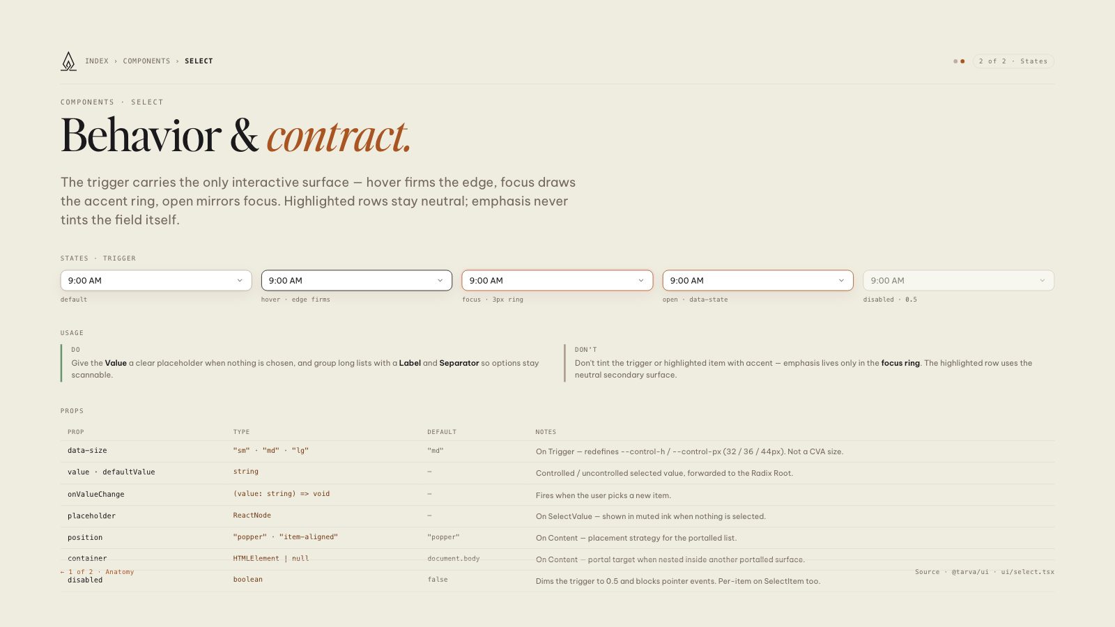
The trigger carries the only interactive surface — hover firms the edge, focus draws the accent ring, open mirrors focus. Highlighted rows stay neutral; emphasis never tints the field itself.
States · trigger
9:00 AMdefault
9:00 AMhover · edge firms
9:00 AMfocus · 3px ring
9:00 AMopen · data-state
9:00 AMdisabled · 0.5
Usage
Do
Give the Value a clear placeholder when nothing is chosen, and group long lists with a Label and Separator so options stay scannable.
Don't
Don't tint the trigger or highlighted item with accent — emphasis lives only in the focus ring. The highlighted row uses the neutral secondary surface.
Props
| Prop | Type | Default | Notes |
|---|---|---|---|
| data-size | "sm" · "md" · "lg" | "md" | On Trigger — redefines --control-h / --control-px (32 / 36 / 44px). Not a CVA size. |
| value · defaultValue | string | — | Controlled / uncontrolled selected value, forwarded to the Radix Root. |
| onValueChange | (value: string) => void | — | Fires when the user picks a new item. |
| placeholder | ReactNode | — | On SelectValue — shown in muted ink when nothing is selected. |
| position | "popper" · "item-aligned" | "popper" | On Content — placement strategy for the portalled list. |
| container | HTMLElement | null | document.body | On Content — portal target when nested inside another portalled surface. |
| disabled | boolean | false | Dims the trigger to 0.5 and blocks pointer events. Per-item on SelectItem too. |
8.5 × 11 · Portrait