Tarva BXD · LumosIndex › Components › Selection · 1
1920 × 1080 · Landscape
 Index › Components › Selection · 1
1 of 2 · Selection
Index › Components › Selection · 1
1 of 2 · Selection
Components · Selection
Quietly chosen.
The five controls that capture a choice — one, several, on or off, a value along a range. The check, the dot, the filled track sit in neutral ink; accent waits for the focused field alone.
Checkboxdata-state · data-size
Unchecked
Checked
Indeterminate
Focus ring
Disabled
sm · 14
md · 16
lg · 20
Radix box + indicator.
checked shows the Check, indeterminate the shared Minus glyph — both on primary ink. Size rides a data-size attribute (sm/md/lg), not a variant.Switchsize · sm/md/lg
Off
On
Focus ring
Disabled
sm · w-7
md · w-9
lg · w-11
A boolean track + thumb.
size selects a coupled track / thumb / travel triple. On fills with primary ink; the thumb stays white at every size.Radio Groupone of a set
Studio session
In-home visit
Virtual consult
No preference
RadioGroup + RadioGroupItem — exactly one selected, marked by the filled dot. Focus shows the terracotta ring; the disabled row dims. data-size scales box + dot together.Checkbox Groupfieldset · select-all · validation
Treatments*
Select all (2 of 4)
Facial
Massage
Body wrap
Sauna
Warning tier
Email updates
SMS reminders
Pick at least one channel
Error tier
Accept terms
Selection is required
A
<fieldset> + <legend> binding N checkboxes as one set. Tri-state select-all shows the Minus when partial; orientation is the sole variant. warning pairs amber + icon (no aria-invalid); error sets it.Slidersingle thumb · range · focus
Single value
64
Focused thumb
40
Range · two thumbs
25–75
Disabled
30
Radix track / range / thumb. One thumb for a value, two for a range — pass an array to
defaultValue. The filled range carries primary ink; the focused thumb takes the terracotta ring. data-size scales the thumb.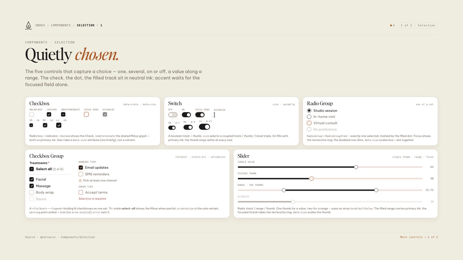
8.5 × 11 · Portrait