Tarva BXD · LumosIndex › Components › Checkbox · 1/2
1920 × 1080 · Landscape
 Index › Components › Checkbox
1 of 2 · Checkbox
Index › Components › Checkbox
1 of 2 · Checkbox
Components · Checkbox & Radio
The checkbox.
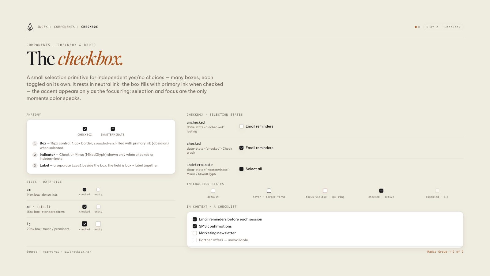
A small selection primitive for independent yes/no choices — many boxes, each toggled on its own. It rests in neutral ink; the box fills with primary ink when checked — the accent appears only as the focus ring; selection and focus are the only moments color speaks.
Anatomy
Checkbox
Indeterminate
1Box — 16px control, 1.5px border,
rounded-sm. Filled with primary ink (obsidian) when selected.2Indicator — Check or Minus (MixedGlyph) shown only when checked or indeterminate.
3Label — a separate
Label beside the box; the field is box + label together.Sizes · data-size
sm
14px box · dense lists
checked
empty
md · default
16px box · standard forms
checked
empty
lg
20px box · touch / prominent
checked
empty
Checkbox · selection states
unchecked
data-state="unchecked" · resting
Email reminders
checked
data-state="checked" · Check glyph
Email reminders
indeterminate
data-state="indeterminate" · Minus / MixedGlyph
Select all
Interaction states
default
hover · border firms
focus-visible · 3px ring
checked · active
disabled · 0.5
In context · a checklist
Email reminders before each session
SMS confirmations
Marketing newsletter
Partner offers — unavailable
8.5 × 11 · Portrait