Tarva BXD · LumosIndex › Components › Button
1920 × 1080 · Landscape
 Index › Components › Button
Flagship · variants + states
Index › Components › Button
Flagship · variants + states
Components · Button
The button.
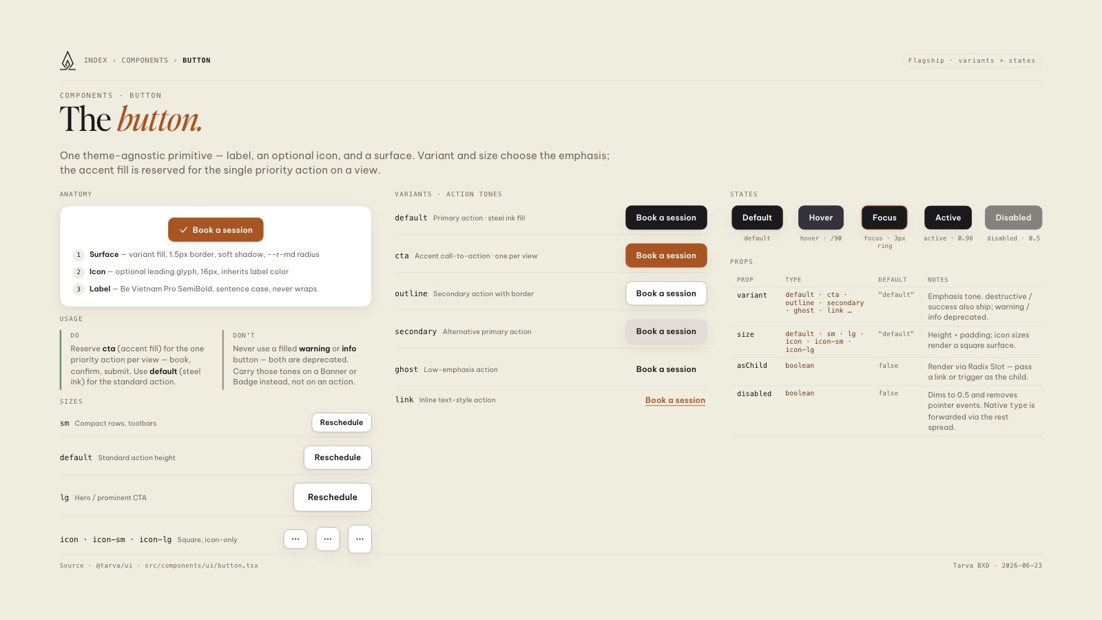
One theme-agnostic primitive — label, an optional icon, and a surface. Variant and size choose the emphasis; the accent fill is reserved for the single priority action on a view.
Anatomy
1Surface — variant fill, 1.5px border, soft shadow, --r-md radius
2Icon — optional leading glyph, 16px, inherits label color
3Label — Be Vietnam Pro SemiBold, sentence case, never wraps
Usage
Do
Reserve cta (accent fill) for the one priority action per view — book, confirm, submit. Use default (steel ink) for the standard action.
Don't
Never use a filled warning or info button — both are deprecated. Carry those tones on a Banner or Badge instead, not on an action.
Sizes
sm
Compact rows, toolbars
default
Standard action height
lg
Hero / prominent CTA
icon · icon-sm · icon-lg
Square, icon-only
Variants · action tones
default
Primary action · steel ink fill
cta
Accent call-to-action · one per view
outline
Secondary action with border
secondary
Alternative primary action
ghost
Low-emphasis action
link
Inline text-style action
States
default
hover · /90
focus · 3px ring
active · 0.98
disabled · 0.5
Props
| Prop | Type | Default | Notes |
|---|---|---|---|
| variant | default · cta · outline · secondary · ghost · link … | "default" | Emphasis tone. destructive / success also ship; warning / info deprecated. |
| size | default · sm · lg · icon · icon-sm · icon-lg | "default" | Height + padding; icon sizes render a square surface. |
| asChild | boolean | false | Render via Radix Slot — pass a link or trigger as the child. |
| disabled | boolean | false | Dims to 0.5 and removes pointer events. Native type is forwarded via the rest spread. |
8.5 × 11 · Portrait