Tarva BXD · LumosIndex › Components › Selection · 2
1920 × 1080 · Landscape
 Index › Components › Selection · 2
2 of 2 · Selection
Index › Components › Selection · 2
2 of 2 · Selection
Components · Selection · 2
Pick one.
Value-triggers, typeaheads, and date surfaces — the controls that turn a long list into one committed choice. Accent rests on the open ring and the chosen day; the rest waits in neutral ink.
Selectdata-size · sm/md/lg
Eucalyptus & sage
Scent profile
Eucalyptus & sage
Lavender & chamomile
Citrus (sold out)
Radix value-trigger + listbox. Size is the
data-size attribute (sm/md/lg) redefining --control-h, not a CVA variant. Slots: Trigger · Content · Label · Item · Separator. Selected item shows the trailing ✓; disabled stays in the AT tree.Comboboxvariant · default/error/warning
60-minute facial
fac
60-minute facial
90-minute facial
Single-select typeahead — closed value-trigger over a filtered command-menu listbox of OptionRows (
selectionMode="check"). Variants default · error · warning; size via data-size. Re-selecting the committed value toggles it off.Multiselectmode · popover/inline
3Select services…
Select all3 of 6
Aromatherapyadd-on
Hot stoneadd-on
Multi-select checkbox listbox. Leading count
Badge + clear-all ✕ + tri-state "Select all". Props filterable · showCount · showSelectAll · clearable · maxCount; mode popover (shown) or inline. Toggling a row never closes the popover.Option RowselectionMode · check/checkbox
check · default / highlighted / selected / disabled
Default row
Highlighted
Selected
Disabled
checkbox · unselected / selected / disabled
Unselected
Selected
Disabled
The shared keystone both Combobox & Multiselect render — the only place the two never drift. One real axis:
selectionMode="check" (trailing ✓, left) vs "checkbox" (filling box, right). State via data-highlighted · data-selected · aria-disabled — never hand-coded hues. Size inherits from the list's data-size.Time Pickerformat · 12h/24h
12h · AM/PM
09:
15
AM
24h · showSeconds
14:
30:
00
Token-styled native
<select>s — no third-party dep. format="12h" adds an AM/PM box (left); "24h" omits it (right, with showSeconds). minuteStep 1·5·15·30. The emitted value is always canonical 24-hour HH:mm[:ss], regardless of display format.Date Pickermode="single"
Pick a date
Jun 23, 2026
Mar 9, 2026
June 2026
Su
Mo
Tu
We
Th
Fr
Sa
31
1
2
3
4
5
6
7
8
9
10
11
12
13
14
15
16
17
18
19
20
21
22
23
24
25
26
27
28
29
30
1
2
3
4
Popover + Button (outline) + Calendar. Closed placeholder "Pick a date", committed value (format="MMM d, yyyy"), and hasError border — opening reveals the month. String API value/defaultValue as YYYY-MM-DD; props min · max. Closes once a day is chosen.Calendardensity · comfortable/compact
June 2026
Su
Mo
Tu
We
Th
Fr
Sa
31
1
2
3
4
5
6
7
8
9
10
11
12
13
14
15
16
17
18
19
20
21
22
23
24
25
26
27
28
29
30
1
2
3
4
comfortable · 36px cell
June 2026
Su
Mo
Tu
We
Th
Fr
Sa
31
1
2
3
4
5
6
7
8
9
10
11
12
13
14
15
16
17
18
19
20
21
22
23
24
25
26
27
28
29
30
1
2
3
4
compact · 28px cell
react-day-picker wrapper with a Lumos density axis — comfortable (36px) or compact (28px). All RDP props pass through (mode · selected · numberOfMonths). today takes the accent ring; selected fills accent; range body tints subtly; outside/disabled recede.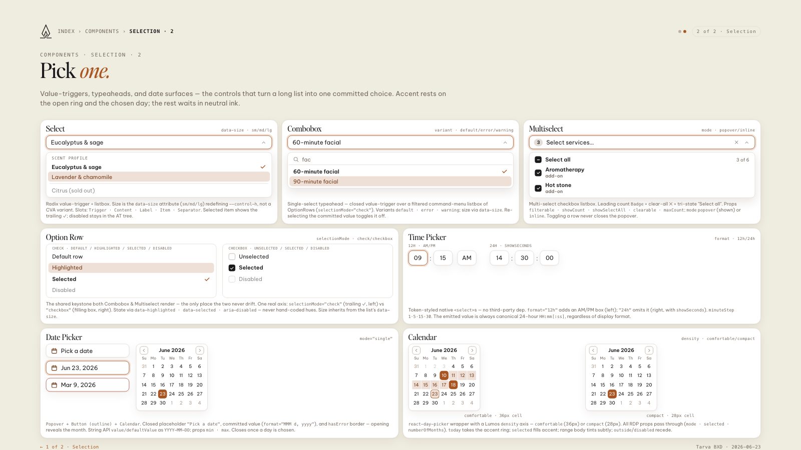
8.5 × 11 · Portrait