Tarva BXD · LumosIndex › Components › Radio Group · 2/2
1920 × 1080 · Landscape
 Index › Components › Radio Group
2 of 2 · Radio Group
Index › Components › Radio Group
2 of 2 · Radio Group
Components · Checkbox & Radio
The radio group.
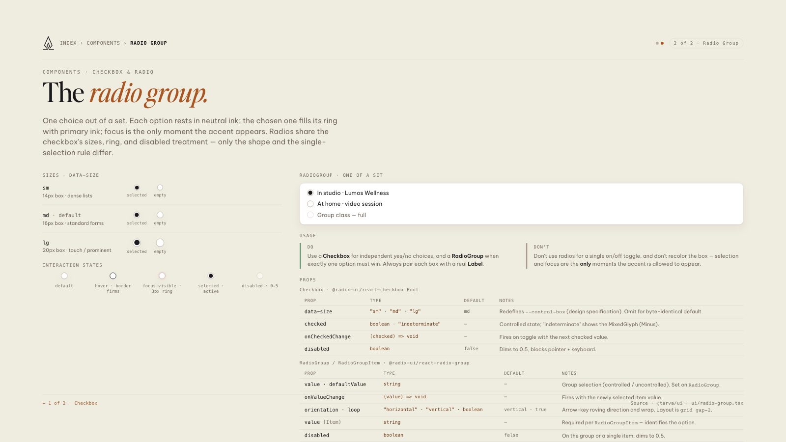
One choice out of a set. Each option rests in neutral ink; the chosen one fills its ring with primary ink; focus is the only moment the accent appears. Radios share the checkbox's sizes, ring, and disabled treatment — only the shape and the single-selection rule differ.
Sizes · data-size
sm
14px box · dense lists
selected
empty
md · default
16px box · standard forms
selected
empty
lg
20px box · touch / prominent
selected
empty
Interaction states
default
hover · border firms
focus-visible · 3px ring
selected · active
disabled · 0.5
RadioGroup · one of a set
In studio · Lumos Wellness
At home · video session
Group class — full
Usage
Do
Use a Checkbox for independent yes/no choices, and a RadioGroup when exactly one option must win. Always pair each box with a real Label.
Don't
Don't use radios for a single on/off toggle, and don't recolor the box — selection and focus are the only moments the accent is allowed to appear.
Props
| Prop | Type | Default | Notes |
|---|---|---|---|
| data-size | "sm" · "md" · "lg" | md | Redefines --control-box (design specification). Omit for byte-identical default. |
| checked | boolean · "indeterminate" | — | Controlled state; "indeterminate" shows the MixedGlyph (Minus). |
| onCheckedChange | (checked) => void | — | Fires on toggle with the next checked value. |
| disabled | boolean | false | Dims to 0.5, blocks pointer + keyboard. |
| Prop | Type | Default | Notes |
|---|---|---|---|
| value · defaultValue | string | — | Group selection (controlled / uncontrolled). Set on RadioGroup. |
| onValueChange | (value) => void | — | Fires with the newly selected item value. |
| orientation · loop | "horizontal" · "vertical" · boolean | vertical · true | Arrow-key roving direction and wrap. Layout is grid gap-2. |
| value (Item) | string | — | Required per RadioGroupItem — identifies the option. |
| disabled | boolean | false | On the group or a single item; dims to 0.5. |
8.5 × 11 · Portrait